
College Parketplace
A mobile app for college students to sell and buy items.
Background
College Parketplace is a mobile app developed by college students for college students. Students living on campus often dispose of furniture/items in their dorms or apartments they no longer need when it comes time to move out because of a lack of space, use, or additional circumstances. On the other hand, there are students looking for cheap and affordable household items/furniture. College Parketplace aims to solve these issues by allowing students to sell their gently used furniture/items to interested buyers.
Tools Used
Figma, Miro
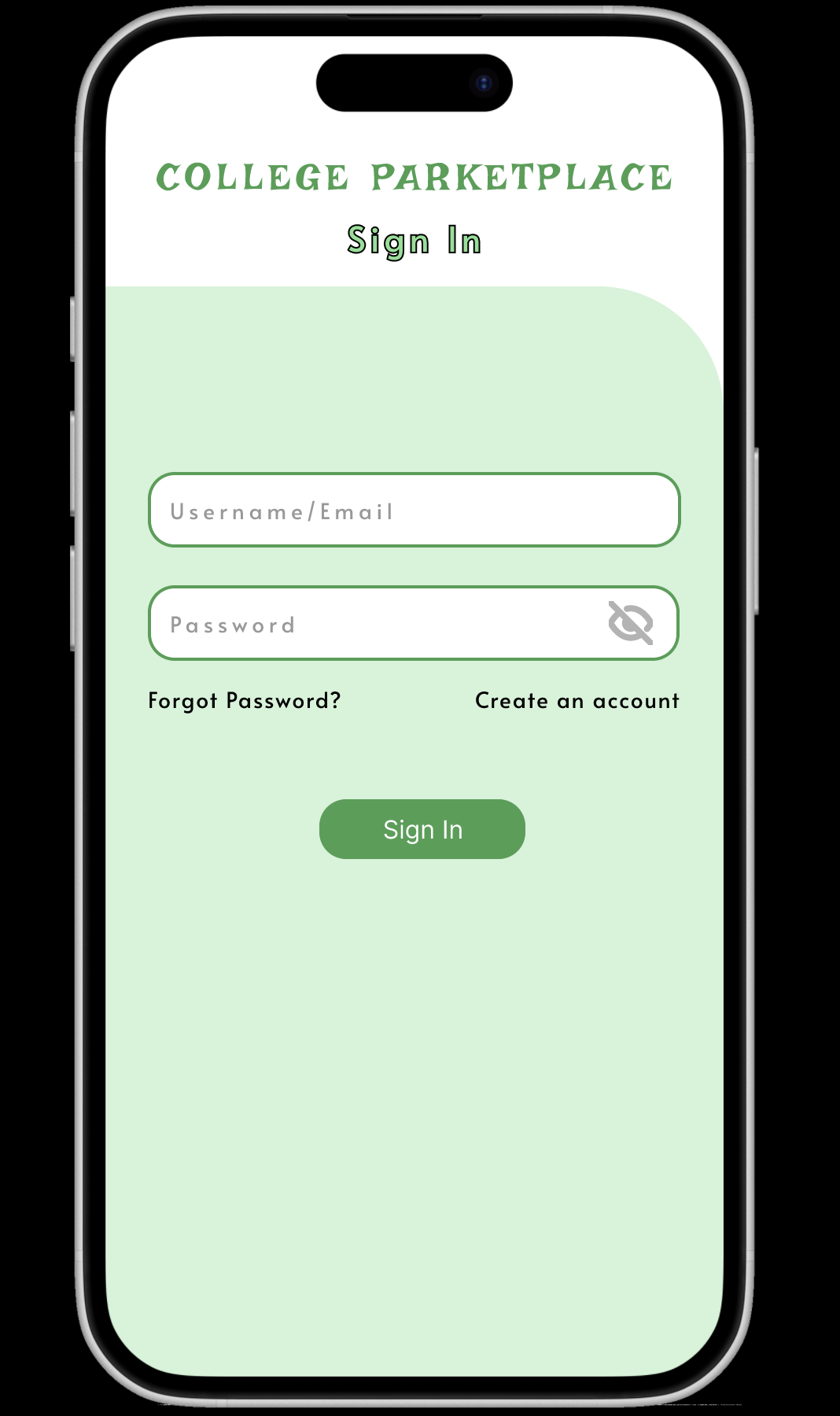
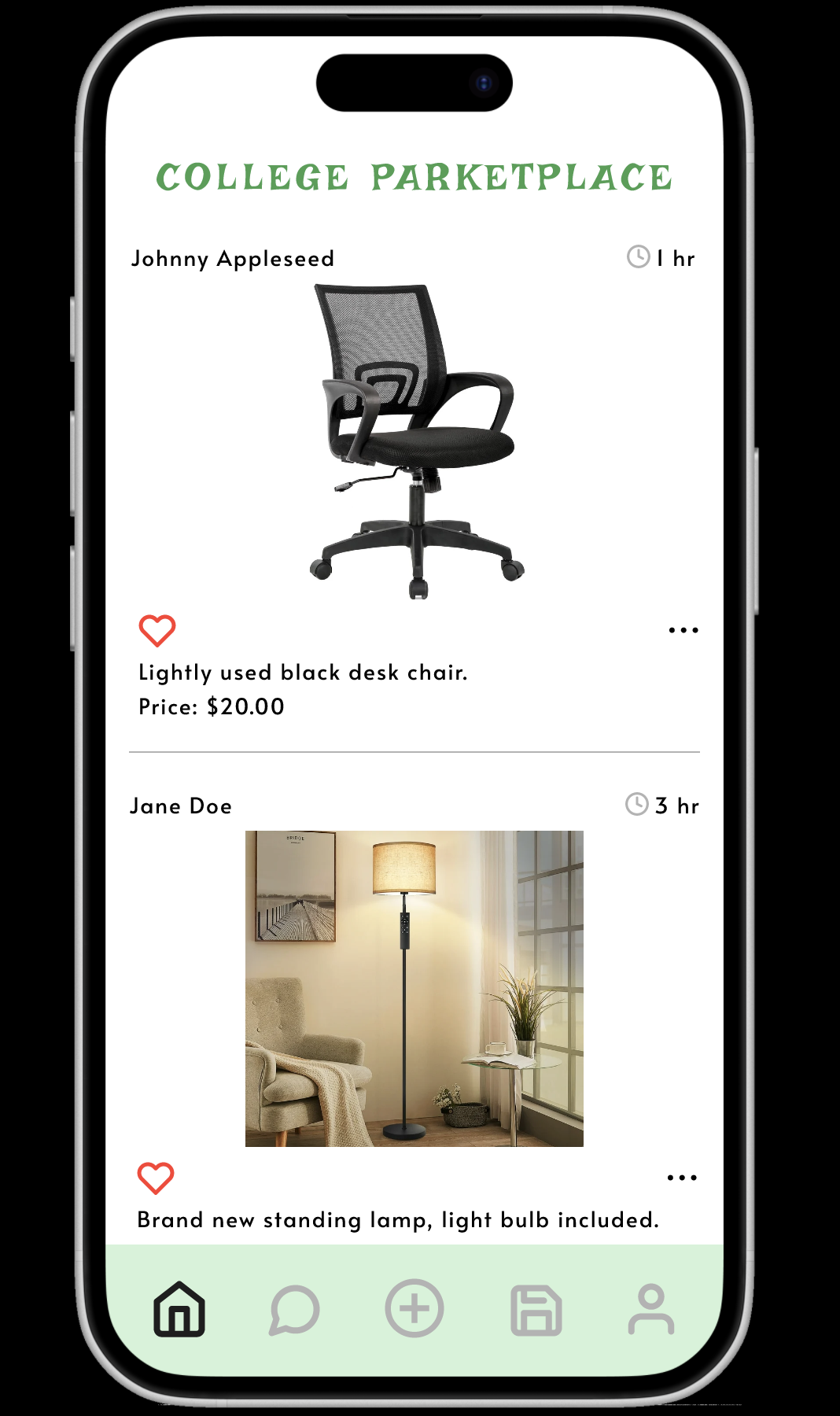
Product Preview


Research
Interviews
To gather information about the needs of our user group (college students), we conducted interviews. To conduct the interviews we reached out to some people we knew who would benefit from this app. To supplement this, we went to apartment complexes in the College Park area and spoke to some of the people around those locations as these people would likely fall into our user group.
One of the interviewees we met with stated,
“I am living in The Alloy (an apartment complex) which does not come furnished, and all the furniture items I’ve looked at are quite expensive”.
Most of the interviews we conducted had a similar consensus which is that they don’t know what to do with their extra furniture at the end of the year, or they can’t find reasonably priced furniture/items. These findings helped us confirm our previous notion of the struggles college students face when it comes to moving in/out. We plan to factor these into the requirements for our design.
Design Iteration
Ideation
Design Alternatives
Paper Prototype
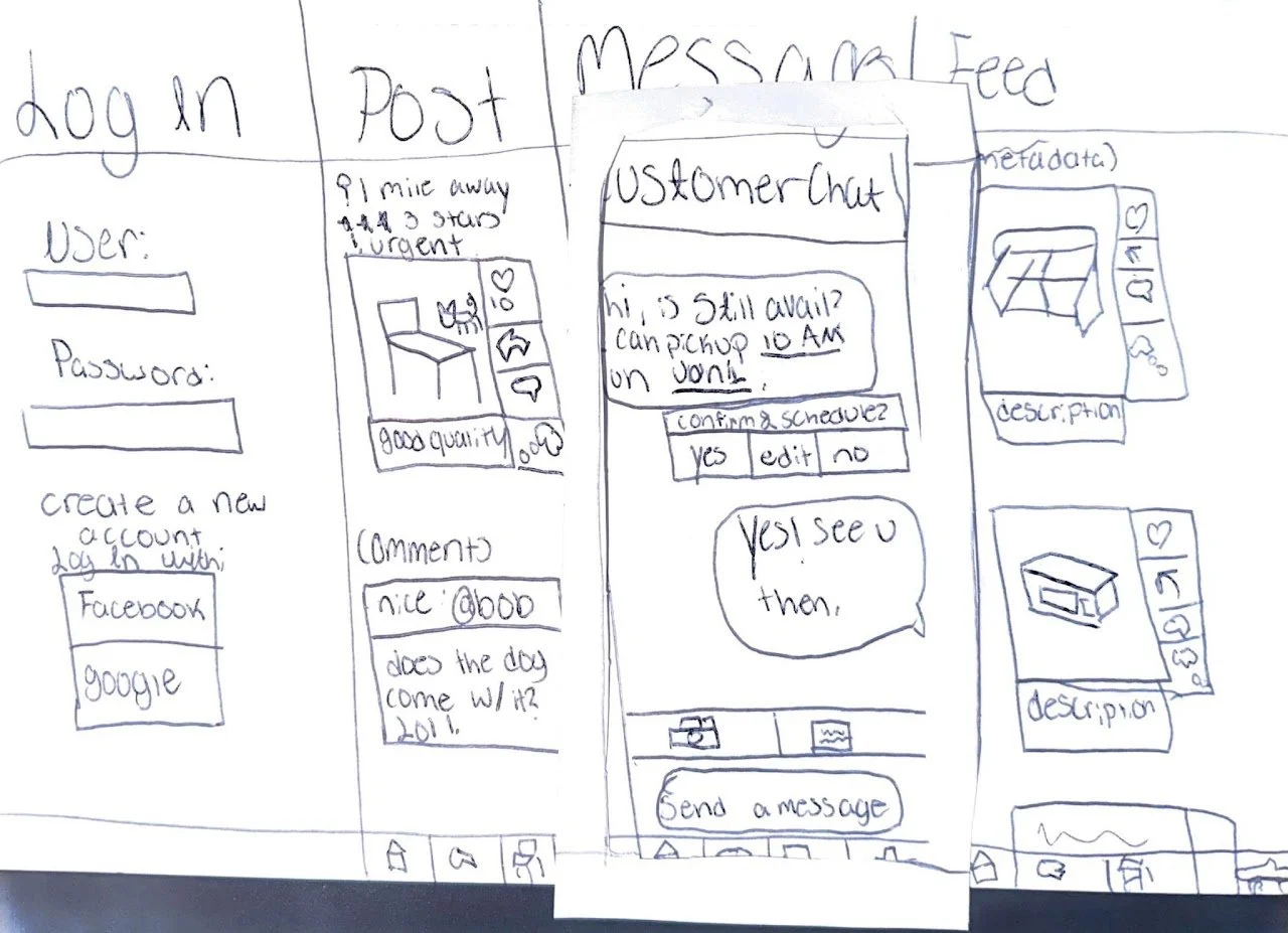
Paper Prototype Example
Wireframes
Scenario 1
Scenario 2
User Testing
Design Successes
Design Shortcomings
Takeaways
After some brainstorming, our group decided that a mobile app would work best for our idea. This mobile app would work similarly to an online marketplace, but be localized to college campuses. We decided to focus on the University of Maryland as this is the school we attend and are most familiar with it. With this in mind, we began to sketch out some initial design alternatives for our app.

After a few iterations of our design alternatives, we created a paper prototype to help bring our design to life. We created the paper prototype with some user tasks in mind that we wanted to include in our final design and test out their usability.
The first task was to allow the user to scroll through their “feed”.
The next task was to ensure the user can navigate to the messages page and interact with other users through messages.
Another task was to test if the user is able to create a post.
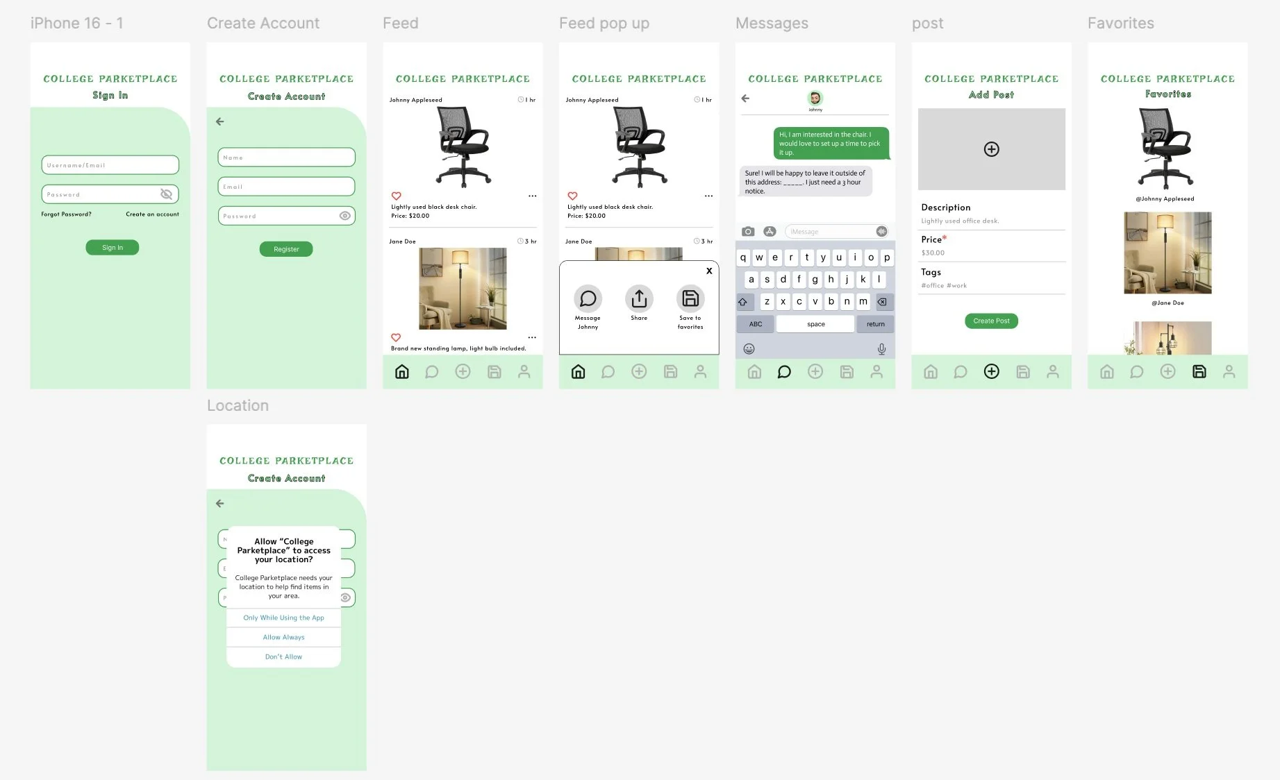
The paper prototype we created kept these user tasks in mind as we included the “Log In”, “Post'“, “Messages”, and “Feed” pages.
We tested the paper prototype out on some potential users to test its efficacy and took the feedback into consideration as we built out our wireframes.
To aid the process of our design, we used some of the user tasks we thought were necessary to the app as a style guide. We used Figma to create these wireframes. Let us walk you through some of our designs through the perspective of a user.
A user has just downloaded College Parketplace to their phone and need to create an account. They press create account, enter their info (not pictured), and select “Allow Always” for tracking location purposes. They are then brought to their feed page.
A user is scrolling through their feed and notices an item they are interested in buying. They click the three dots under the post which brings up a pop-up menu. This menu provides them with a few options of what to do next, but this user wants to send a message to the original poster so they click, “Message Johnny”.
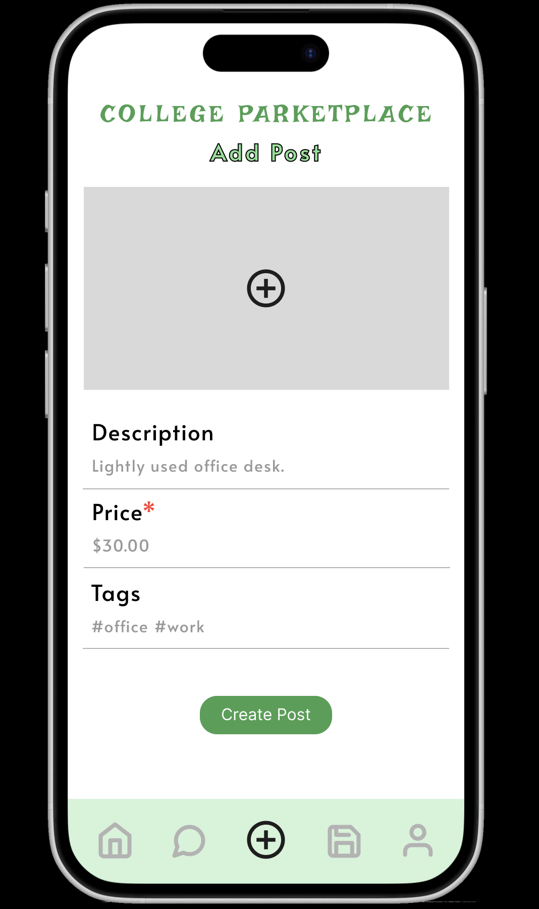
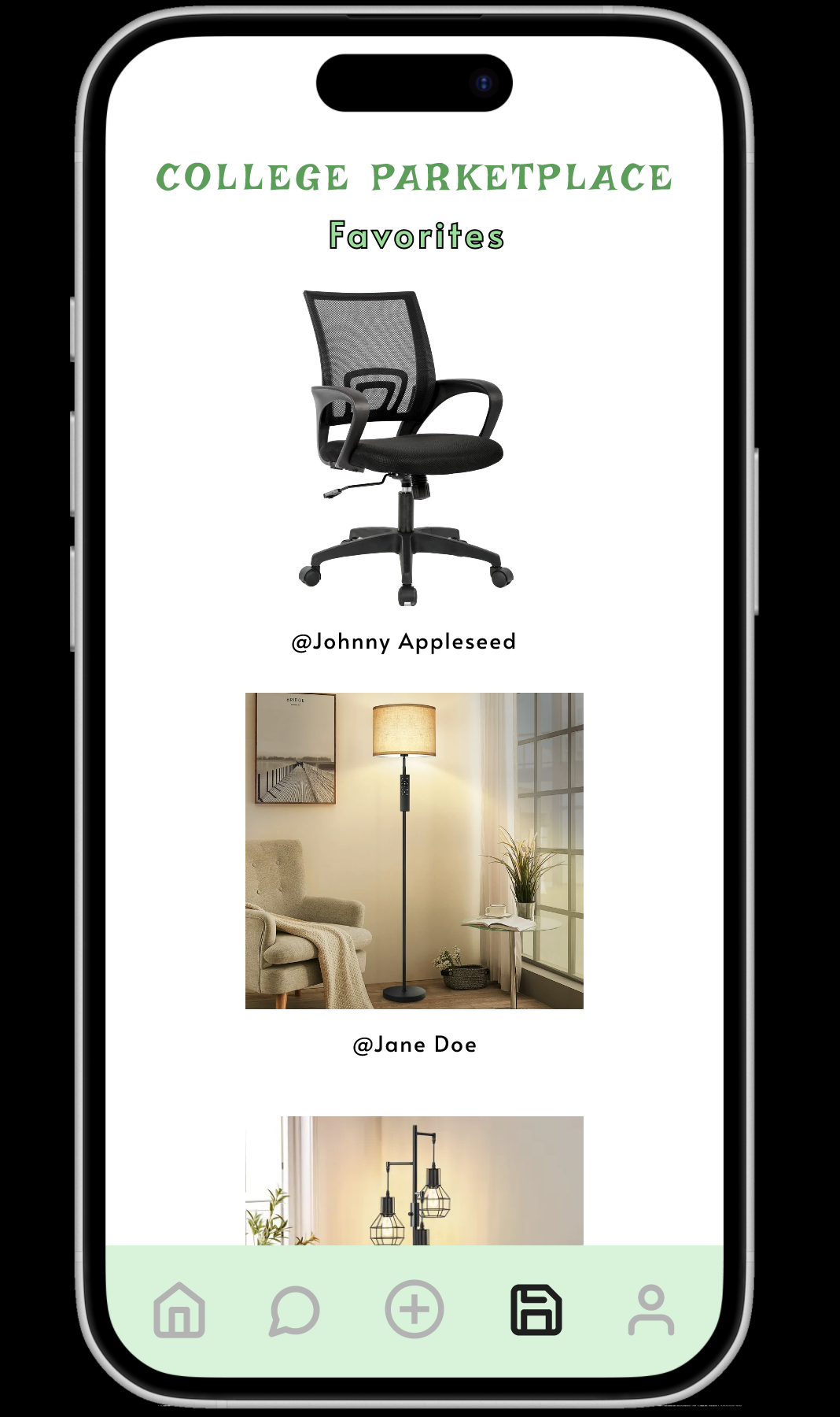
Two other pages of the app we wanted to emphasize were the “Add Post”, and “Favorites” pages. Both are key components to some of the requirements we wanted to include in the design of our app. The “Add Post” page allows users to upload their own items to put on sale. The “Favorites” page allows users to save items they want to look back on later.
We conducted user testing on a few participants who fell into our user group. We instructed them on specific tasks they should try to complete as they navigate the app. Those tasks were:
Create an account, or sign into an existing account.
Make a post.
Scroll through the feed page to search for items.
Inquire about an item.
We took notes on the users’ behaviors and how they approached the tasks which helped us understand the design successes and shortcomings.
Through user testing we were able to compile a list of design successes associated with our wireframes.
The users liked the simplicity of the design. This made it relatively easy to navigate.
Some of the pages have accessible features. One of the users noted they like the prompts given in the “Add Post” page.
Another user noted they liked the continuity of the colors/design across the pages.
Along with taking note of design successes, we made sure to understand our design shortcomings to make improvements for the future.
Login page could have authentication features (sign in with Google/Facebook).
A search element would be useful to help users find specific items.
There should be more information about the location of an item so users know how far that item may be.
After testing the design of our app on different users and coming away with our design successes and shortcomings, there are certainly improvements to be made. For one, we need to make all the pages designed for accessibility. Understanding accessibility guidelines is key to making this design more usable for a wider audience. We also have to consider the efficacy of our service more, specifically how the exchange between buyers and listers may operate. We also felt that adding a feature that shows when an item has sold, or is in the process of being sold might be a useful addition to the use of the app. Overall, this was a great project to learn about the UX design process and we look forward to taking our skills to the next level!

Statements & Acknowledgments
This project originated from the User-Centered Design course at the University of Maryland-College Park. The research was done together as a group: Katie Baron, Diya Patel, and Kayla Sharma all contributed to the original version of the project. I contributed mostly to the design of the wireframes, and the final design solutions which can be pictured below.